Signalnoise: The Art of James White


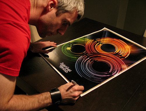
Designer: James White
While moving the term “Riding Retro” forward, several designers are revamping the art of future living from the 80’s. James’ art is clean with organic and opaque vibrant fragments existing and moving in space. While his art implies futurism with age, we like to call it “Vintage Retro”.

Check out the rest of his art at Signalnoise.com and his inspirations.

SATI – Pic Vert Attack


SATI audiovisual : “Pic vert Attack” from Jesse Lucas on Vimeo.

This animation is by SATI. Erwan Raguenes & Jesse Lucas. Good stuff guys! We love their eye catching energetic thrust of minimal graphics in this video. They take you on a depth of field journey (2D to 3D) in a static cyber-world forcing you to take a non-cyclical ride. It hits home with us.

In today’s clubs, visuals are too busy with layers of mindless repeats and random video. Its a pleasure to see audio synced with video, well done. The design process to make such a video is very involved on many levels as many artists struggle to begin a brilliant project. Conceptual brilliance is key. Sati keep rocking it.

The Royal Magazine – Summer Solstice

The Royal Magazine is a superb mag covering Cvltivation of Cvlture: a collection from artististry & designers.

See Summer Solstice issue online.

“Royal is the private journal of The KDU. (Keystone Design Union).
The publication focuses on Collisions, Culture and Capitalism.

We believe that we are more than just editors or filters.
We believe in active media, and live by the rule of “never just observe, always interact.”

We believe that the gravity of our culture is so powerful, nothing and no one are immune to its pull. We are dedicated to injecting sensation back into a numb world.”

Trust the KDU.

New Type Face-Lift

After browsing several blogs this last week, I came across the logo for Zurcher Kammer Orchestra(ZKO), which immediately caught my attention. The ZKO logo was designed by Swiss designer, Gottlieb Soland in 1956. I see thick to thin letterforms with even values and diagonal accents. A minimal design.

“The Zurich Chamber Orchestra is versatile and flexible, its sound transparent, clear and focused. One of the most renown ensemble of its kind, it travels the world as ambassador for Zurich and Switzerland, while in its home in the ZKO-Haus or in the Tonhalle, it acts as host bringing people together through the power of music.”

So, it inspired me to design a new typeface logo for me. I’m Alex.

And a video….