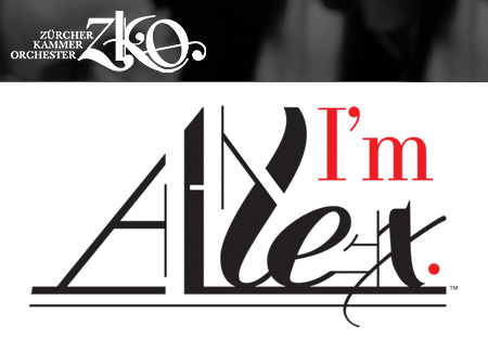
After browsing several blogs this last week, I came across the logo for Zurcher Kammer Orchestra(ZKO), which immediately caught my attention. The ZKO logo was designed by Swiss designer, Gottlieb Soland in 1956. I see thick to thin letterforms with even values and diagonal accents. A minimal design.
“The Zurich Chamber Orchestra is versatile and flexible, its sound transparent, clear and focused. One of the most renown ensemble of its kind, it travels the world as ambassador for Zurich and Switzerland, while in its home in the ZKO-Haus or in the Tonhalle, it acts as host bringing people together through the power of music.”
So, it inspired me to design a new typeface logo for me. I’m Alex.
And a video….